
- /
- /
- /
- /
Performance Detail Summary Dashboard in Analytics
The Performance Detail Summary dashboard is now available in Analytics – here’s how it works.
The Performance Detail Summary is located in Analytics under the “Merchandiser Activity” category. A video tutorial for the Performance Detail Summary is also available by clicking here.
First, let’s check the dashboard parameters by clicking the parameters icon in the top right corner of the dashboard.
![]()
Here we can set a date range and choose which level in the geographical hierarchy to look at.
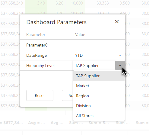
NOTE: Parameter0 is used to enhance the dashboard’s performance, and you should ignore it.
Once the dashboard loads, click on your company row in the top grid to show store info in the lower grid.
For now we’ll stay in the top grid; let’s look at each group of columns:
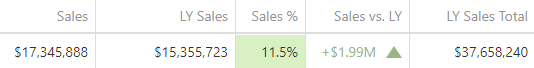
In the sales group, Sales and LY Sales are apples to apples, whereas LY Sales Total is for the entire year.
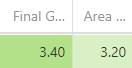
The grade group includes two of the most important grades – Final GPA and Area GPA.
Click here for information about how these grades are calculated.
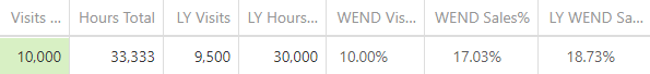
The visits group compares this year’s and last year’s visits and hours.
“WEND” stands for weekend, and we’ve included weekend sales percents along with weekend visits.
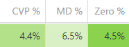
The next group includes additional financial information: CVP, Markdown, and Markdown to Zero percentages.
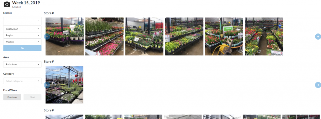
And finally, an Area Report count column is available along with a link to view photos for a given market.
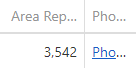
The photos link opens a new dashboard containing store pictures by division, region, market, area and category. Photos are uploaded through the TAP Application through Area Reports and Picture Mode.
Users can navigate between Subdivision, Region, and Market in the picture viewer. Subsequent hierarchy information will dynamically change based on which selections you want to view. Photos are grouped by area. Users can further filter the images through the category tag. Keep in mind that by default all categories are selected.
Navigate through fiscal weeks by clicking the Previous and Next buttons.
Additional tips:
- There is a lot of information in this dashboard – note that hovering over hidden object descriptions, header or column total will display a the full value.
- Cell highlight colors are based on the GPA associated with the column value. Higher grades are greener; lower grades are redder.
- Click here for information about how these grades are calculated.